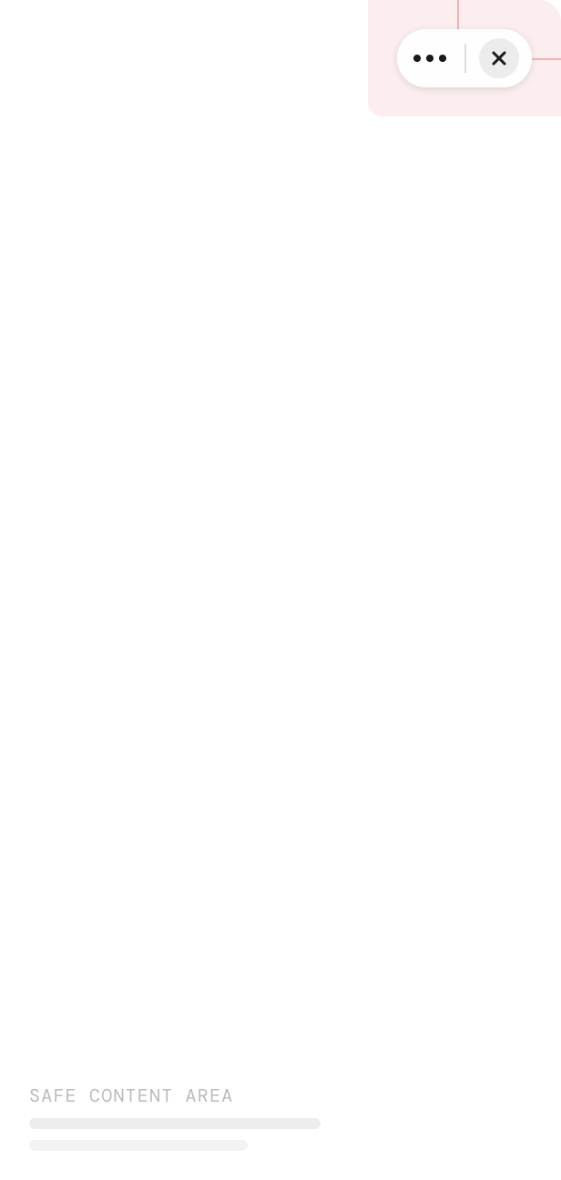
Mini App webviews run inside the MentraOS companion app. The top-right corner of the webview is reserved for the MentraOS capsule menu (≡ / ✕) — your content must stay clear of it.

The capsule menu

PropertyValue
Size73 × 30 px
Top offset8 px
Right offset8 px
ShapePill (fully rounded)
Don’t place buttons, menus, badges, tabs, navigation actions, floating actions, status indicators, or popovers behind the capsule.
Safe area diagram showing the capsule menu in the top-right corner and the safe content area below

Using the SDK

@mentra/react exposes the capsule’s bounding rect and a derived safeAreaTop value so your layout can adjust without hardcoding pixels. Outside MentraOS (e.g. a browser preview), the rect is null and safeAreaTop is 0, so your app renders normally.

useCapsuleMenu hook

Most apps just need enough top padding to clear the capsule:
import { useCapsuleMenu } from "@mentra/react"

function MyScreen() {
  const { safeAreaTop } = useCapsuleMenu()

  return (
    <div style={{ paddingTop: safeAreaTop }}>
      <h1>My Mini App</h1>
    </div>
  )
}
safeAreaTop is rect.bottom + 8 when inside MentraOS, 0 otherwise.

getCapsuleMenuRect()

For fine-grained layout (e.g. positioning a header exactly next to the capsule), read the full rect:
import { getCapsuleMenuRect } from "@mentra/react"

const rect = getCapsuleMenuRect()
if (rect) {
  // rect.top, rect.right, rect.bottom, rect.left, rect.width, rect.height
}
The CapsuleMenuRect type:
interface CapsuleMenuRect {
  top: number
  right: number
  bottom: number
  left: number
  width: number
  height: number
}

Next Steps

React Webviews

Build webviews with @mentra/react

Hardware Capabilities

Check device display capabilities